Interview: Stan Klimek - Photography and the Fine Art of Platinum/Palladium Printing
Kashmir, © Henri Cartier Bresson Estate from the book Magnum Founders Verso, Editions.
If you have never personally seen a well printed platinum/palladium (Pt/Pd) photograph, then this entire interview may make no sense to you. It is magical, it is romantic, it is breathtaking, and it is like no other printing process out there. One of the oldest and most archival processes known, platinum/palladium printing has been in practice since the 1800s and, as it is produced with extremely stable, precious metals, it is both exclusive, expensive, and worth it.
Platinum/palladium prints are contact printed on high-quality, textured cotton papers and the image is contained within the paper rather than just sitting on the surface. Varying combinations of platinum and palladium affect the tonal range and the warmth or coolness in appearance of the final image. As the paper has a very matte surface, the images have a very different look and feel to so many other printing processes. Every single element of the process–from the density of the negative, to the combination of the metals, to the paper coating process, to the UV source, to the exposure, to the air temperature and to the humidity both in the air and in the paper, affect the final result. This is not an experiment; this is carefully controlled and artfully crafted science. Ultimately, when the art, science and craftsmanship all come together with a quality photograph, it is magical.
USS Wasp, © George Tice. Explosion Aboard the U.S.S. Wasp, 1959
Magic is tone. Magic is texture. Magic is precious metals. Magic is visual perfection. Platinum/palladium prints are famous for their incredible range and smoothness of tones. Many of the world’s most respected photographers such as Irving Penn, Imogen Cunningham, Henri Cartier Bresson, George Hurrell, Sally Mann, Beth Moon and so many others have printed or have had printed their art in the platinum/palladium process–and photographer and Master Printer Stan Klimek is the artist that many of these venerable photographers have chosen to print their work.
The experience of viewing these prints really cannot be described in words, you need to see them in person to understand just why this process is so respected and photographs made using this process live in so many museums, galleries and collections. The publisher 21st Editions goes so far as to have Mr. Klimek hand-print images for their ultra-premium and limited-edition books that you need to see to believe. This level of craftsmanship, attention to detail and production, is so very rarely seen in these times that it is well worth the investment to own, or at the very least the effort to see in person, books and prints of this quality.
I met Mr. Klimek several years ago while researching printers to work with for a personal project and was immediately taken with his knowledge, expertise and passion for what he does. As both a photographer and printer, Stan understands the art, the nuance and the vision of the artist and how to bring all of these to life in a process like no other. It was a very educational experience meeting Mr. Klimek as he answered my many questions, and I am honored to call him a friend. Take the journey through his artistic story and experience a little taste of his passion and knowledge of this beautiful process. Then, please find a way find a way to see one of his beautifully printed platinum/palladium prints and then you’ll understand this magic.
Interview
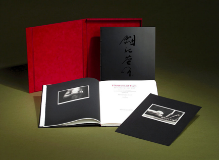
© Flowers of Evil by the artist Eikoh Hosoe, Publisher, 21 St. Editions
https://www.21steditions.com/artists#/eikoh-hosoe
© Sally Mann, Publisher, 21 St. Editions
https://www.21steditions.com/artists#/sally-mann-nudes
Tim Scott: Can you tell us a bit about your journey from “I think I like photography” to deciding to make photography your career choice?
Stan Klimek: In my early days just out of High School in 1970, it was the days of traveling and I was no exception. So, I stuck my thumb out from Southern California and headed to NYC where I ended up driving a Taxicab. Loved it and I actually made some good money for someone my age but it soon became time to go back home. A bit directionless in regards to where I wanted go in life, I would gravitate to the nearest local library and found myself captivated in the libraries fine art section, and could not get enough of it. In time I discovered the fine art of photography section and at that point the doors swung open as if to say ‘What took you so long’! Enrolled into CSU Fullerton, CA and studied under Eileen Cowin and Ron Leighton and never doubted for a moment. Photography became the last thing I thought about before I went to sleep and the first thing I thought about when I awoke. My Father bought me my first camera, a Nikon Nikkormat with a 105mm/ f2.5 Nikkor lens and I slept with it that night.
© Stan Klimek, Torso.
TS: You had already established yourself as a successful commercial photographer prior to moving into platinum/palladium printing. Can you share some of your commercial experiences, good and bad, and how you think that your commercial experience affects your printing process?
SK: I went into commercial photography, I had a past of fine art from the fine art photography department at CSUF but I was interested in all forms of photography and it doesn’t hurt to get food on the table through the commercial side. I moved to L.A. and started to put a portfolio together and in time I did start getting some good jobs after many years of huffing the portfolio. The one thing I loved about L.A. was that you did not have to have a studio, when you got a job you could rent everything and anything that would complement the execution of the assignment, just plug it into the expense part of the budget. Part of this charm was the availability of any type of camera, lighting, studio, assisting, models etc. I won some very good awards, but you were still shooting for an art director who had a pre-conceived idea of what he wanted through the comps. In time, the call of fine art was calling again from my earlier days and I started a slow journey back to the fine art of photography. Trusting my intuition, I started shooting what inspired me. Eventually I started to look for a new signature or process for printing my captures. Going through the extreme grainy, lacquer thinner transfers, manipulated Polaroid’s etc. I stumbled across John Richardson and Norma Smith (Norma who regretfully passed recently) introduced me to platinum printing through a workshop. Here was a time-honored, archival and hand coated process that melded into the paper and gave the tactile look. Couldn’t get enough of it and transformed my apartment into a platinum printing room and eventually became equally obsessed with gum and gum-over-platinum as well. Time to split L.A. so I grabbed my dog ‘Dagor’ and headed to Santa Fe, NM. Once again ya gotta get food on the table so I started showing my work in platinum and gum prints. Eventually a publisher in Santa Fe, James Crump of Arena Editions was starting out and asked me if I would print the ‘free floating’ prints that would be included in two new books of his publications for Keith Carter and Kenro Izu which started my new chapter.
© Robert Capa from the book Magnum Founders, published by Verso Editions
TS: There are many different printing processes that have been developed over the history of photography. What drew you to platinum/palladium and why did you ultimately choose this process?
SK: It was the ‘look’. The Matte finish, the tactile representation of the image that was melded into the paper fibers as opposed to the reflective look of silver printing. The time-honored respect of a hand coated process and archival stability. In addition, gum over platinum gave a unique signature as well. For example, any time you add color to an image it adds an additional emotional response. Another signature of gum printing for either all gum print or GOP is that you can brush out selective parts of the image with a brush while under development giving you, if you wish, a ‘painterly’ look.
TS: For those not as familiar with the platinum/palladium printing processes, can you give a brief synopsis of the process itself and the pros and cons (from your perspective) of some of the other “traditional” processes?
SK: To begin with, platinum printing is a ‘contact’ process where you shoot for a negative that will be contacted to the coated paper to be exposed under UV lighting. You can scan the negative as well for a negative large enough for the contact exposure as well, no enlarger is used for this contact step. Handmade or mould made paper of 100% cotton fiber or rice paper is used for the paper or substrate. There are many steps in between but to simplify this hand coated paper of Pt/Pd salts is suspended into a measured amount of ferric oxalate which act as the sensitizer that makes it react to Ultraviolet light source using either a vacuum table or printing frame. It is exposed to UV light and then developed with either ammonium citrate (colder tone) or potassium oxalate developer (warmer tone) and then cleared with various chemicals, washed and laid/hung to dry waiting for a heated mat press for flattening and then spotting the finished print. As I also do gum printing and gum over platinum printing the procedure is the same with the exception that the sensitized gum overlays on the dried platinum print are mixed up with water color pigment, a sensitizer and gum arabic re-registered on the all platinum print with the or different negative exposed to UV light, developed in room temperature water. At this point is where you can start brushing out highlights etc. Hung to dry and cleared later with potassium or ammonium dichromates, wash archival and hung to dry.
© Imogen Cunningham from the book Imogen Cunningham, Symbolist. Published by 21ST Editions, The Art of the Book.
TS: Can you tell us about your own personal work and how you experienced as a commercial photographer as well as a Master Printer affect your approach to your own work?
SK: I believe it all ties together from your past experiences. In the commercial world once you receive your assignment and layouts you pre-conceive mindfully how you will execute the project from beginning to end. In the fine art world, to me it is pretty much the same. You conceptualize the idea and then pre-visualize all the necessary steps for realization of your original idea. One exception here I guess would be documentary photography where random capture is all about timing.
TS: You have printed for some of the most well-known names in contemporary photography as well as work for such prestigious, long past photographers like Henri Cartier Bresson, Robert Capa and others. Can you share a story or two about working with some of your favorites and how each photographer or estate manager’s approach affected how you approached printing their work as fine art?
SK: When you work from artists who have already have a set of images for you to work on it is all about the time-honored process limited edition printing. This edition printing goes back hundreds of years and hastens for working with the artist. First, you receive the original prints from the estate or the artist, they may be silver prints, they may not have the original negatives available which is possible sometimes with well-known estates. From the image received from the artist you will make a negative from the original print or use the original negative to get scans made. The scans are created to the size requested by the artist as most alternative process printmaking uses contact negatives. The original print from the artist has now become the reference print that illustrates all the tone and ‘feel’ the artist seeks. At this point you create the negative from the original and use it for the discovery phase of the first platinum print made to match the originally provided reference print. You make a first working print and present to the artist. If the artist approves your interpretation, he/she/estate will sign it with their signature and title it with either ‘Printers proof’ or BAT. BAT is a French word borrowed heavily from the past meaning ‘Bon á tirer’ or ‘good to pull’, a traditional term that goes back hundreds of years. The BAT will now become the reference print that all must follow. If the edition is ten of that one image all of the following prints must match the reference print exactly in order to get signed off. A perk of the industry when all is said and done with all the different prints comprising the Artists traditionally give the signed BAT to the printer as a way of saying thank you or to always have it on file for future printing. One example with the Henri Cartier Bresson Estate was when Martine Franck (who was the estate manager–who also was a Magnum Photographer and was once married to Bresson) received 12 separate reference prints awaiting sign off prior to beginning the printing. The feedback was that she believed that all the prints looked good except that Bresson’s black signature border from his filed-out Leica film transporter frame was too wide. We all gave a collective sigh of relief knowing that the change was super easy, and we were on!
© Greg Gorman, Rex and Gregory, published by 21st. Editions
TS: I know that this is a bit of a loaded question, but why is platinum/palladium printing so expensive and why do so many artists choose this process as one of the highest expressions of their work?
SK: Yeah, it is a good question especially now where palladium is more expensive than gold or platinum. Platinum is a time-honored art where you need to source all your chemicals, paper, noble metals from scratch. The chemicals come from Bostick & Sullivan or you purchase the regent chemicals from chemical warehouses. The paper may come from Europe and is 100% mould made or handmade paper used in the intaglio, lithographic and alternative processes. Chasing down the correct nuance you need for a new negative can be time consuming and costly in discovering the sweet spot. It is an old-world process that has been rescued from the past. To make a 24x30” Pt/Pd print after all of the discovery and wasted prints to reach perfection could be 300.00 dollars or more just in materials–and this is not counting days of a critical chase down. You may have an argument as to whether Pt/Pd is the highest expression of their art with another. Between the factor in the stability, the tactile look precious metal melded into the fibers of a 100% handmade or mould paper it is a joy that you will never get tired of.
TS: It seems that you are working with high end book publishers as much now as directly with photographers. Is this different from working directly for photographers and how do you think that fits within the fine art marketplace and its idiosyncrasies?
SK: Book publishers or a limited edition of 10 to 20 images all printed in platinum with a book edition of 25 or so can take an extreme amount of hard-core time. For example, for a book, an edition of 100, of work by Sally Mann and published by ‘21st Editions’, included 14 separate images, plus one that’s called a ‘free-floating image’ in the back. That translates roughly to 110 books. An edition of 100 books plus 10 lettered copies. It took a year. Even printing exhibition prints for artists–say 8 separate images with an edition of 10–is very time consuming and expensive as well.
TS: Ultimately, how much difference does the camera, the quality of the original art (the negative, the positive or the file) make to the final product?
SK: All cameras are great–even the pin hole cameras–as long as your pre-visualized vision warrants it. Pre-visualize what you seek in every possible way including the tools and final presentation material to compliment it and just get to work.

© Keron Psillas, Cavalo Luisitano. Pubilished by Veritas Editions.
https://www.veritaseditions.com/cavalo-lusitano-the-spirit- within/zzin9pxkvqjkaiow4kz2n2rge8ku29
For more information visit:
Stan Klimek
Platinum Printing
21st Editions
GALLERY


ABOUT THE AUTHOR
Tim Scott is a working creative director in the world of advertising and design with an obsessive passion for photography. Tim’s dedication to all things visual and story-telling has led him through the top agencies in NYC as a creative director and art director working with brands, global and national. Tim now lives and works from the edge of Los Angeles County in Pomona, California with his beautiful wife Rachel. He is a writer and curator for Analog Forever Magazine. Connect with Tim Scott on his Website and on Instagram!


These images are the AF Team's curation of the most stand out must-see images produced in 2022. From career photographers to amateur hobbyists, these scenes and portraits made a huge impact this year!